Mix & Match Bathroom Tiles: Pro Tips to Pair Floor & Wall Like a Designer
- songyod thomtitchong
- Dec 7, 2025
- 3 min read

Updated: Mar 17

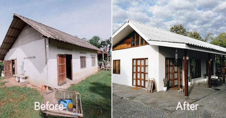
Mix & Match means pairing different floor and wall tiles to create personality, depth and functional zones — without losing harmony. Below are clear principles, colour-pair ideas, safety tips and layout tricks pros use.

Why Mix & Match works
Adds dimension and visual interest
Defines wet vs dry zones clearly
Lets you control budget by mixing price tiers
Creates a high-end look without full renovation

Classic colour pairs that always work
White — Grey: Modern, clean, makes small bathrooms feel larger.
Cream — Brown: Warm, resort-like, natural.

Blue — White: Fresh, coastal, relaxing.
Marble floor + Mosaic wall: Elegant texture and focal detail.
Dark plain floor + Natural wood wall: Warm yet modern contrast.

Rule: Keep the floor simple — avoid competing patterns that shrink the room.

Practical pairing rules (floor vs wall)
Floor: prioritize anti-slip (Matt or textured), R11+ for wet zones.
Wall: glossy/cleanable finishes for easy maintenance; decorative tiles for focal walls (vanity, shower niche).
Material tip: Porcelain / granitto for wet & outdoor resilience.

Pro composition & layout tricks
Vertical wall tiles → visually increase ceiling height.
Diagonal floor layout (45°) → visually expands width/length for small baths.

Light floor + dark border / tile skirting → frames the room and adds depth.
Match grout to tile colour for seamless flow (light grout with light tiles).

Safety + maintenance
Use matte/anti-slip on floors; glossy on walls for easy cleaning.

Aim R11+ in shower/wet zones.
Choose low-absorption tiles in humid climates and easy-clean glazes for walls.

Quick checklist before ordering
Which zone gets R11+ tiles? (shower, entrance)
Will grout match or contrast?

Which wall gets the feature tile? (vanity / shower niche)
Tile sizes: mid-size (e.g., 30×60) often balance pattern & installation.


Looking for a professional renovation contractor in Phnom Penh?Explore our main renovation service page to learn more about our process and completed projects.
🇰🇭 Khmer (ភាសាខ្មែរ) — Mix & Match ក្បឿងបន្ទប់ទឹក: ជ្រើសផ្ទៃជាន់ និងជញ្ជាំងឲ្យចម្រុះដូចអ្នកជំនាញ
Mix & Match ជាការបង្កើតលំនាំដ៏ពិសេស ដោយផ្គូផ្គងក្បឿងជាន់ និងជញ្ជាំង ដើម្បីបន្ថែមអត្តសញ្ញាណ និងមิติ។
ហេតុផលដែល Mix & Match សារៈសំខាន់
បន្ថែមសកម្មភាពភ្នែក និងលាយលំដាប់
បំបែកតំបន់សើម និងស្ងួតបានច្បាស់
អាចគ្រប់គ្រងថវិកា ដោយរួមបញ្ចូលក្បឿងចំណាយខុសៗគ្នា
បង្កើតមើលប្រណីតដោយគ្មានការកែប្រែធំ
កូណ៍ពណ៌ថ្មងាយស្រប
ស — ប្រផេះ: ទំនើប និងខ្យល់ទូលំទូលាយ។
គ្រីម — ត្នោត: កក់ក្តៅ និងស្ទីលរីសត៍។
ខៀវ — ស: ស្រស់ស្រាយ និងបរិយាកាសសម្រាក។
ផื้นម៉ារបល + ជញ្ជាំងម៉ូសៃក: ប្រណីត និងមានរូបភាព។
ផื้นខ្មៅសាមញ្ញ + ជញ្ជាំងឈើ: កក់ក្តៅ ប៉ុន្តែនៅតែទាន់សម័យ។
គោលការណ៍យកចិត្តទុកដាក់
ជាន់: ផ្ទៃ Matt / Anti-slip, R11+ សម្រាប់តំបន់សើម។
ជញ្ជាំង: ផ្ទៃ Glossy សម្អាតងាយ, ប្រើក្បឿងពិសេសតែមួយកន្លែងជាគន្លងផ្តោត។
សម្ភារៈ: Porcelain/Granitto សាកសមសម្រាប់តំបន់សើម។
វិធីសាស្ត្រផ្សំសមាសងាយៗ
ដាក់ក្បឿងផ្ទាំងច្រកឈរ → បង្កើនកម្ពស់មេដាន
ដាក់ផ្ទាំងមុំ 45° → ធ្វើឲ្យថ្លៃត្រង់ធំឡើង
ផ្ទៃស្រាល + សៀកខ្មៅជាយក្ស → បង្កើតមิติ
ប្រើពណ៌ grout តែមួយជាមួយក្បឿងសម្រាប់ទិសដៅរលូន
សុវត្ថិភាព និងថែទាំ
ជ្រើស พื้นไม่ลื่น សម្រាប់พื้น; ភ្លឺសម្រាប់ជញ្ជាំង។
R11+ សម្រាប់ផ្នែកងូតទឹក។
ជ្រើសក្បឿងដែលស្រូបទឹកតិចក្នុងតំបន់សើម។
🇨🇳 Chinese (简体) — 浴室 Mix & Match 瓷砖搭配:地砖×墙砖,专业设计师的配法与技巧
Mix & Match 是通过混搭地面与墙面瓷砖来创造个性与层次感的当代设计手法。下面是实用规则、经典配色、以及落地可用的铺贴技巧。
为什么要 Mix & Match?
增加空间层次感与趣味性
明确干湿区划分
更灵活的预算控制
快速提升质感与视觉焦点
经典配色组合
白 — 灰:现代、干净、扩展视觉。
奶油 — 棕色:温暖、度假感。
蓝 — 白:清新、海滨风。
大理石地 + 马赛克墙:高雅且有纹理对比。
深色地 + 木纹墙:现代且温馨的对比。
地砖 vs 墙砖 的实用分配
地砖:首选哑面/防滑,湿区建议 R11 以上。
墙砖:建议光面便于清洁;重点墙用装饰砖(洗手台墙、淋浴壁龛)。
材质建议:釉面瓷/瓷质砖(porcelain)更适合潮湿环境。
视觉放大与比例技巧
竖向铺贴墙砖 → 视觉增高
斜铺地砖(45°) → 视觉延展空间
浅色地 + 深色收边或踢脚 → 清晰框架感
同色硅缝(grout) → 延续视觉面,减少割裂感
安全与保养要点
地面优先防滑,墙面强调易清洁
湿区防滑等级 R11+,日常保持良好排水
在潮湿与多雨气候下选低吸水率与耐候材质

Comments